Creative mailer for a community center
Written on March 26, 2012 by Stephen Emlund | Leave a comment
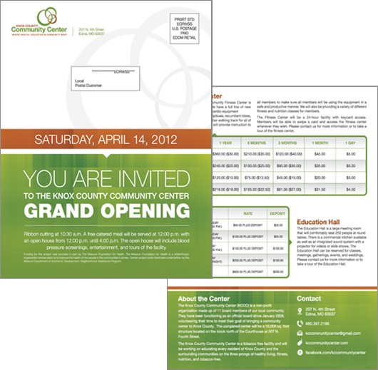
This printed mailer was recently sent out to residents of Knox County (up here in Northeast Missouri). It measures 8.5 x 11 inches and was mailed flat. Talk about massive impact! I hope the size, message and layout are the perfect combination to get people to the grand opening on April 14!
The branding was followed through in this mailer by using the colors from the logo, the same typeface and complementary visual elements (rounded corners, clean icons and small triangle pointers). I mentioned this before – but working with Knox Community Center has been a great experience in creating a cohesive set of visual material – everything from color choice, logo, website, and (very soon) letterhead, envelope and business cards.
Making the simple complicated is commonplace; making the complicated simple, awesomely simple, that’s creativity.
One of the most important reasons to hire a professional designer is for that expertise in communicating visually and cohesively. The goal in your next project should be to communicate your message as simply as possible.
One of my favorite quotes on design was actually said by a jazz bassist – Charles Mingus. He says, “Making the simple complicated is commonplace; making the complicated simple, awesomely simple, that’s creativity.” That quote is printed on the back of our business cards and we keep that idea front and center in all of our projects.
Fee free to contact us if you have a project in mind where we can help you make the complicated simple.

